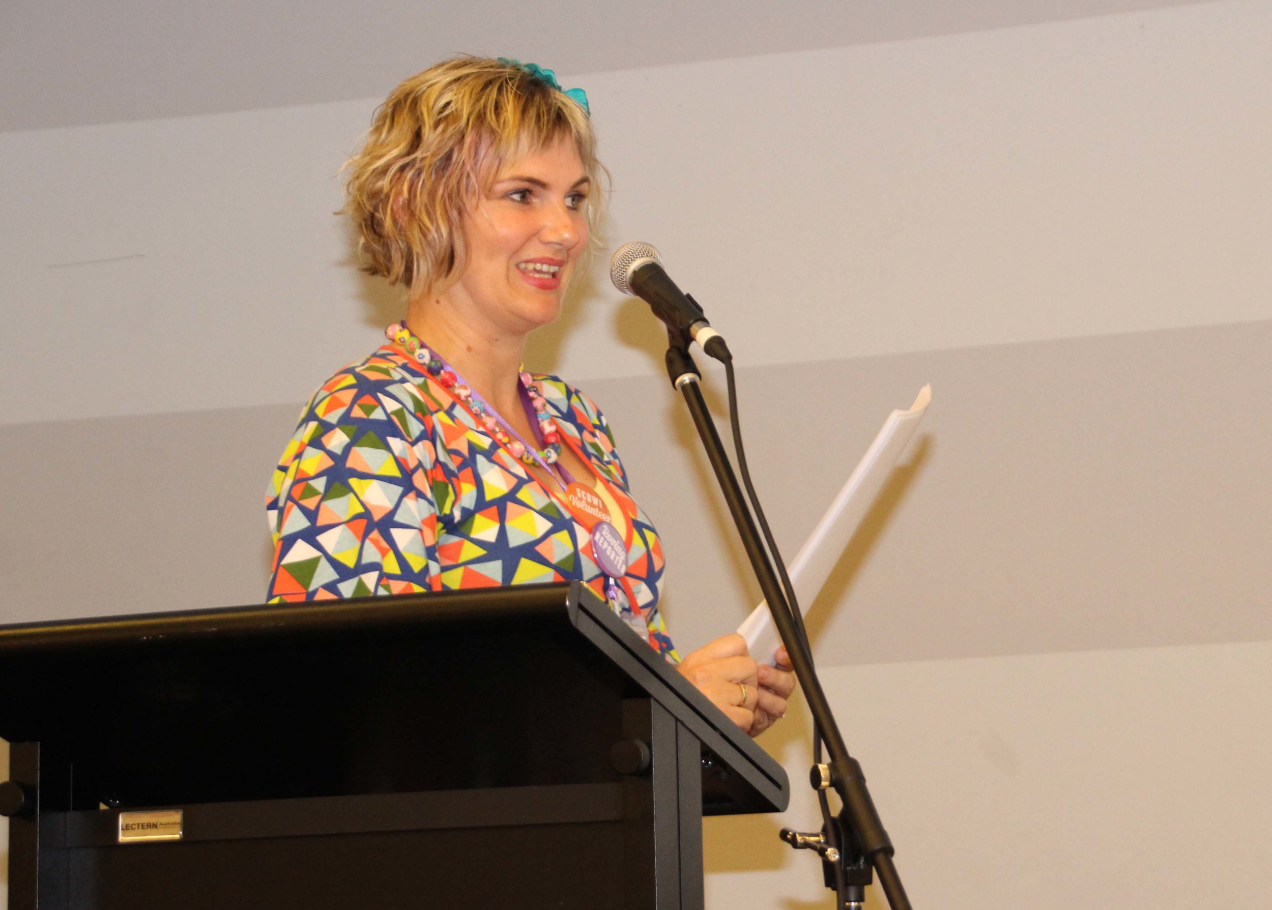
Illustrious Illustrator, Sarah Davis attempting distracting techniques
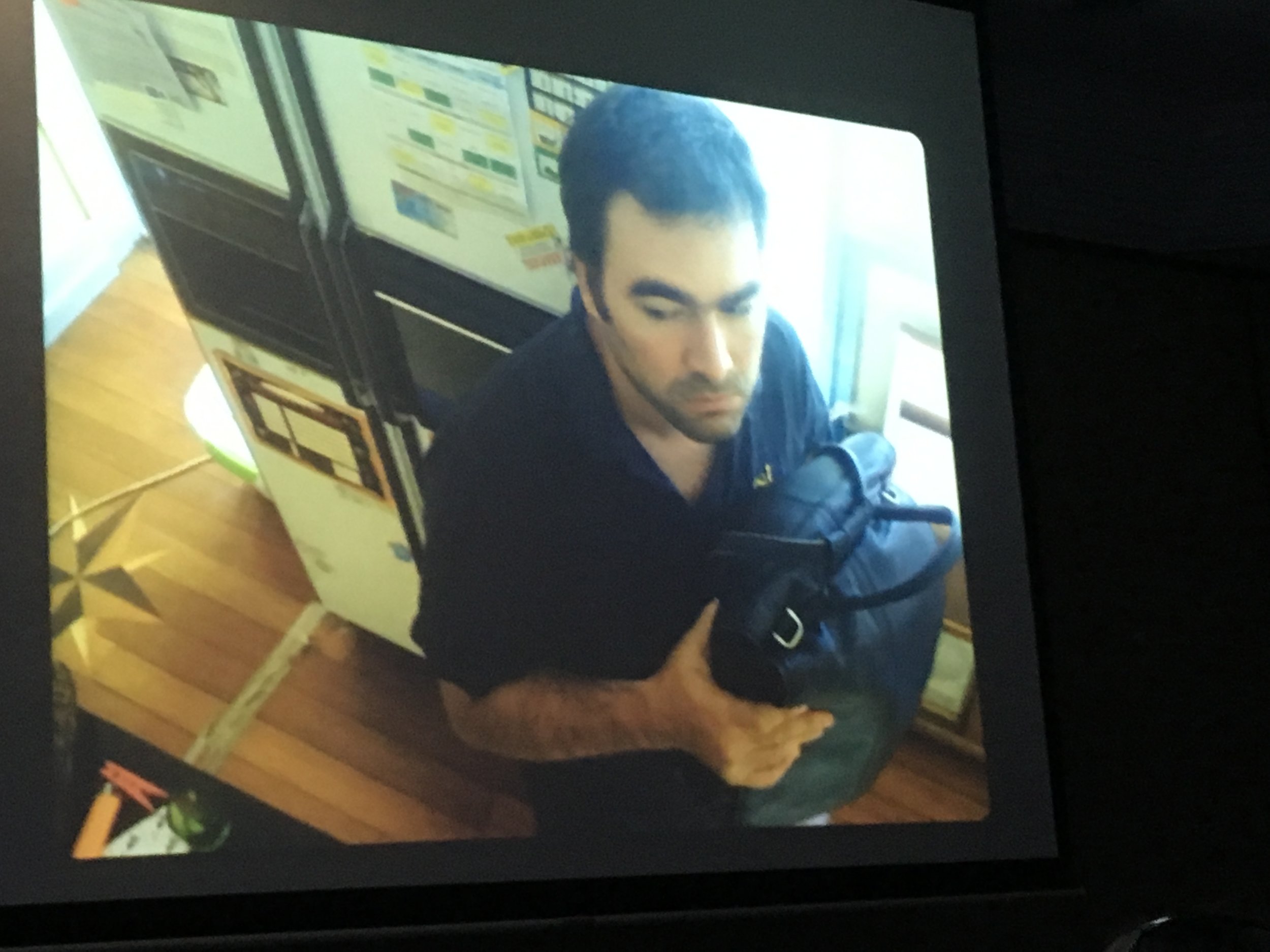
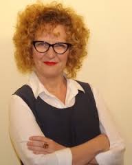
Prior to this year’s SCBWI conference I knew we were in for a treat when I learned Sarah Davis would present a workshop and sure enough it has been an absolute delight. I was pleasantly surprised, though, when Sarah started off with a little slide show enlightening us about her own “unremarkable life story of a very ordinary, humble, unassuming mild mannered illustrator” and her many heroic deeds (saving polar bears, being an astronaut, bringing us world peace and fixing climate change) all before she started her illustrator career. Most definitely she meant to distract us from her amazing and mostly self-taught illustration skills but I am happy to report she didn’t succeed in this attempt.
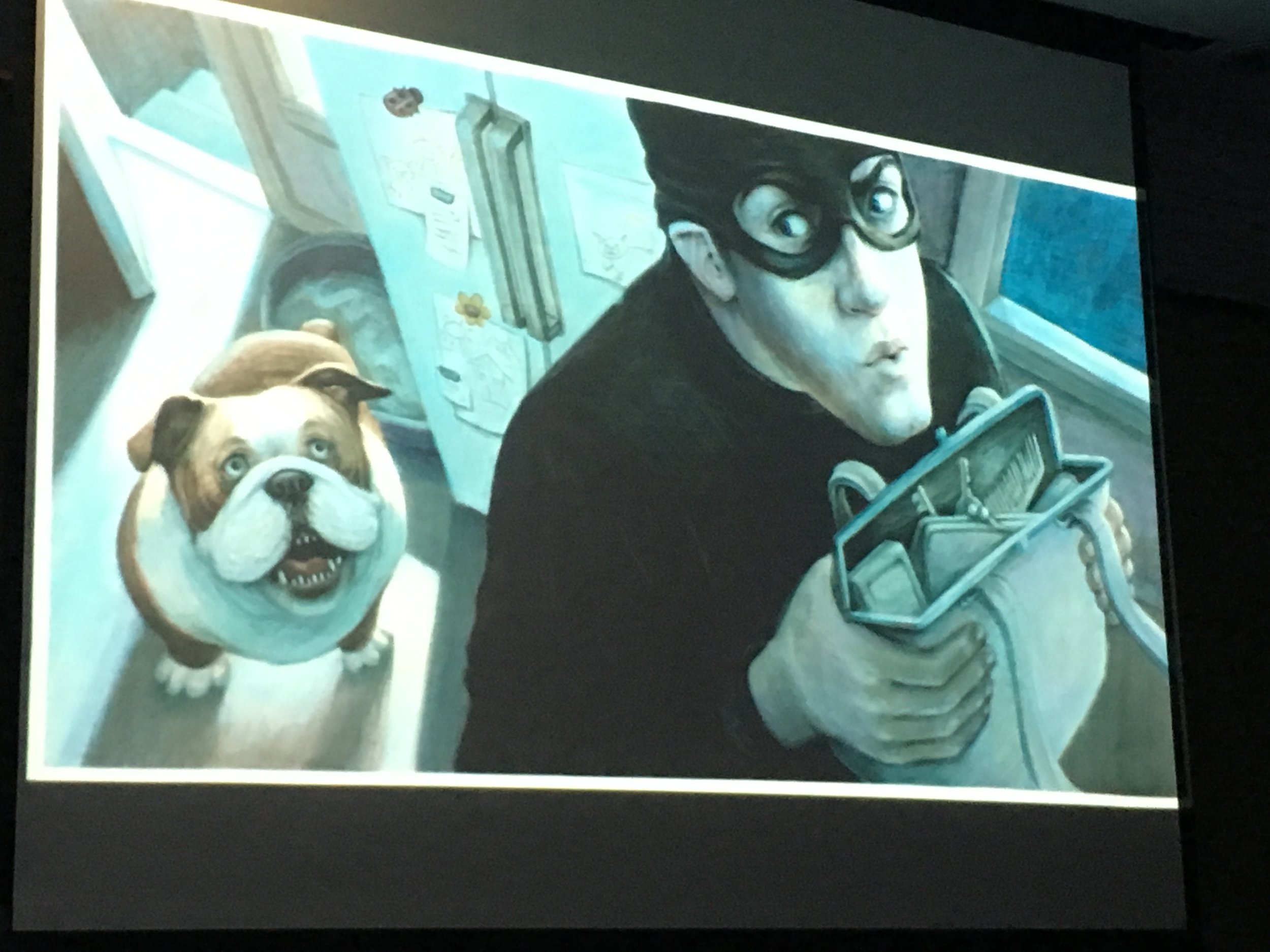
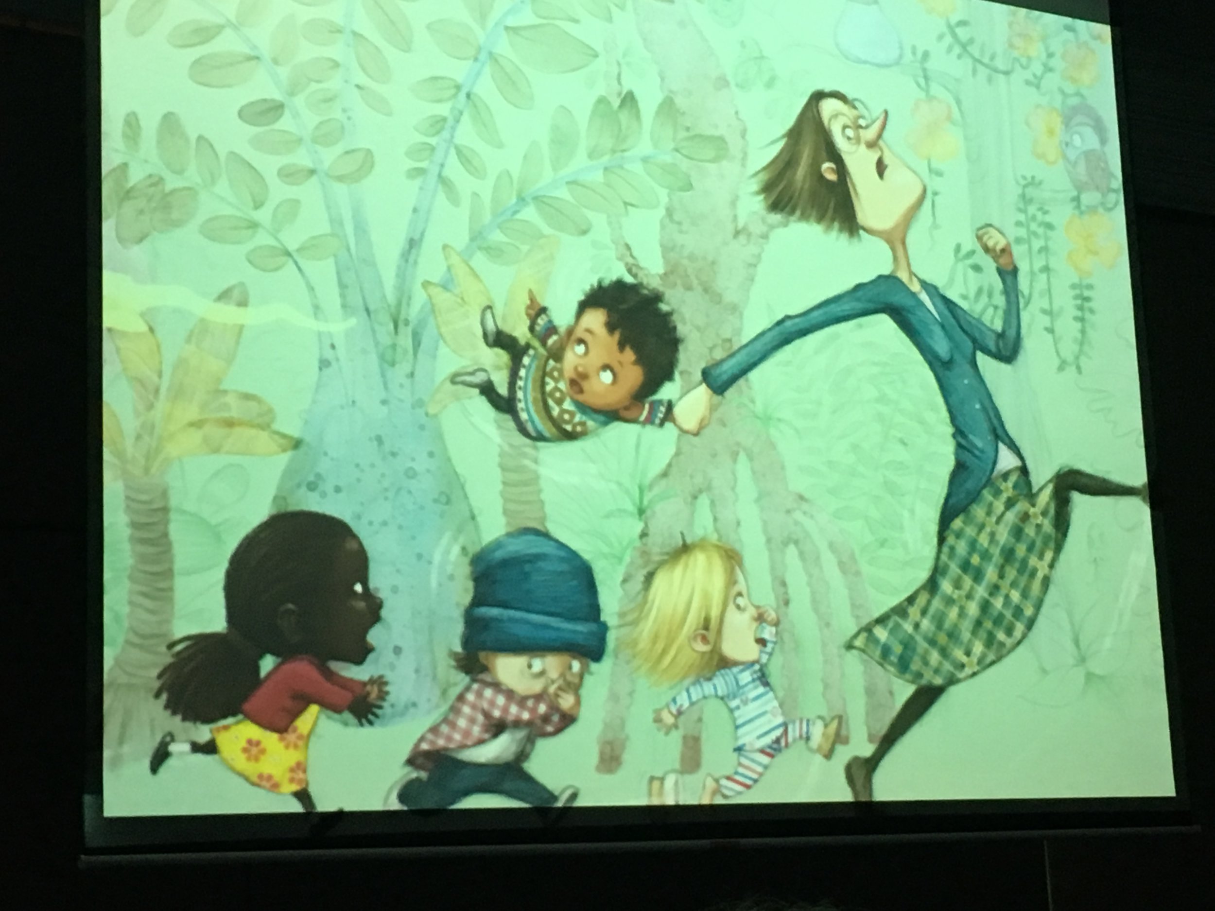
First up talking about illustrated book characters, Sarah pointed out they need to be convincing and there are different ways to achieve that. Her own characters clearly are a product of her “obsession with bringing them to life”. The reader can connect with these characters by experiencing them as pure individuals. This is supported by the three principles of character design:
- shape
- proportions
- energy
Just as the shape of your character or even just its face’s shape can carry emotional weight (a triangular face oozes evil!), the energy levels add to that (a hunched over character demonstrates sneaky ambitions while an upright character can convey a happy energy). Playing around with your characters’ proportions can open up a whole new level of character design and be very enriching, too.
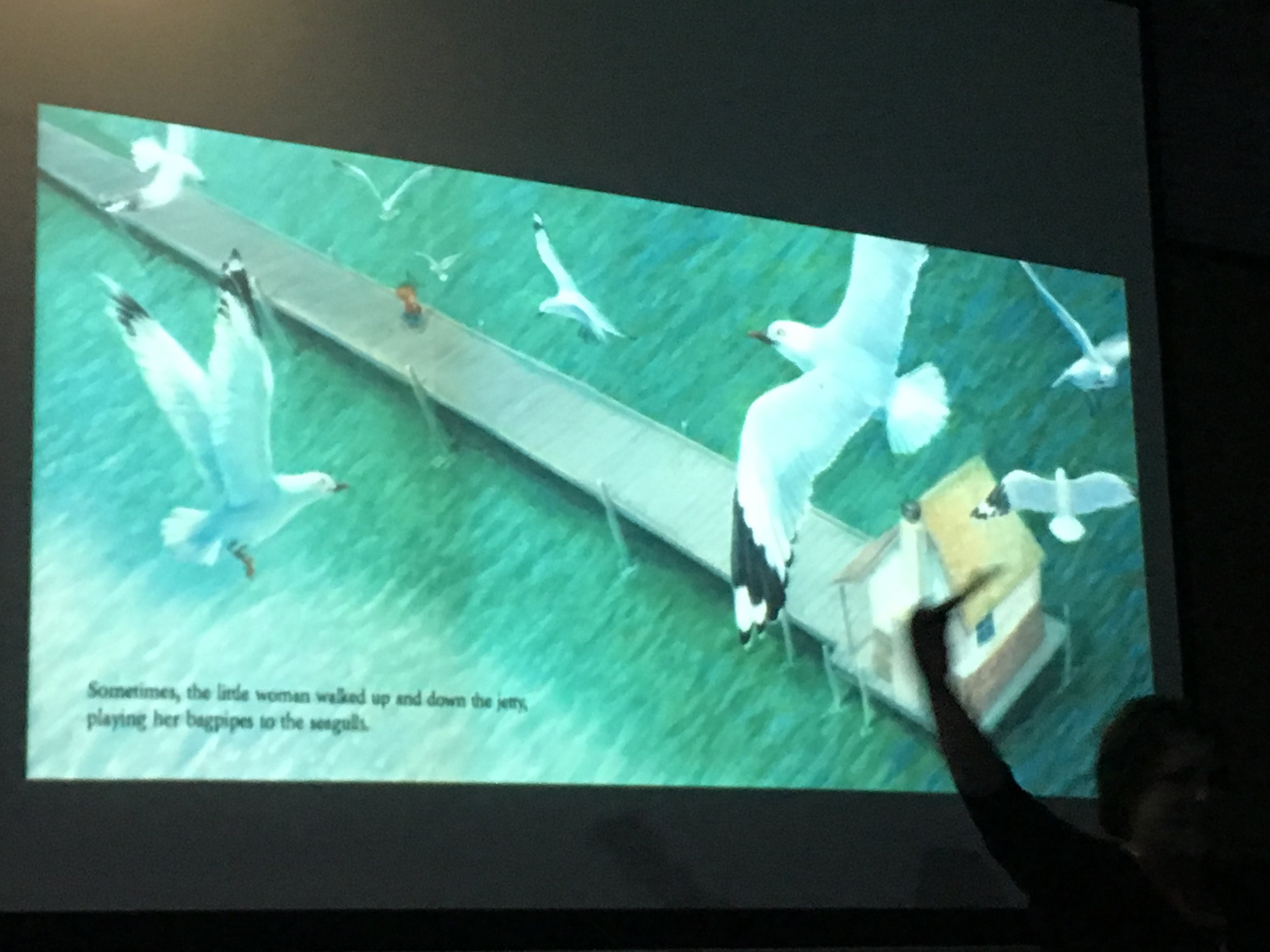
Another important part in creating a visual narrative is perspective. Sarah demonstrated that by your choice of the focal point you can achieve different kinds of connections with the illustration. For example, if your focal point is on eye level with your character it can convey a sense of intimacy and closeness. This might well reveal a character’s softness. In comparison, if you chose a distant focal point this could create a sense of harshness and underline the character’s fierce side. Personally, I was not quite aware that perspective could influence your perception of the character’s disposition that much. So this was quite an eye opener.
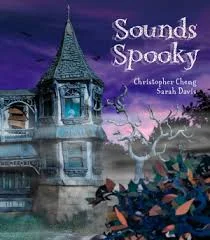
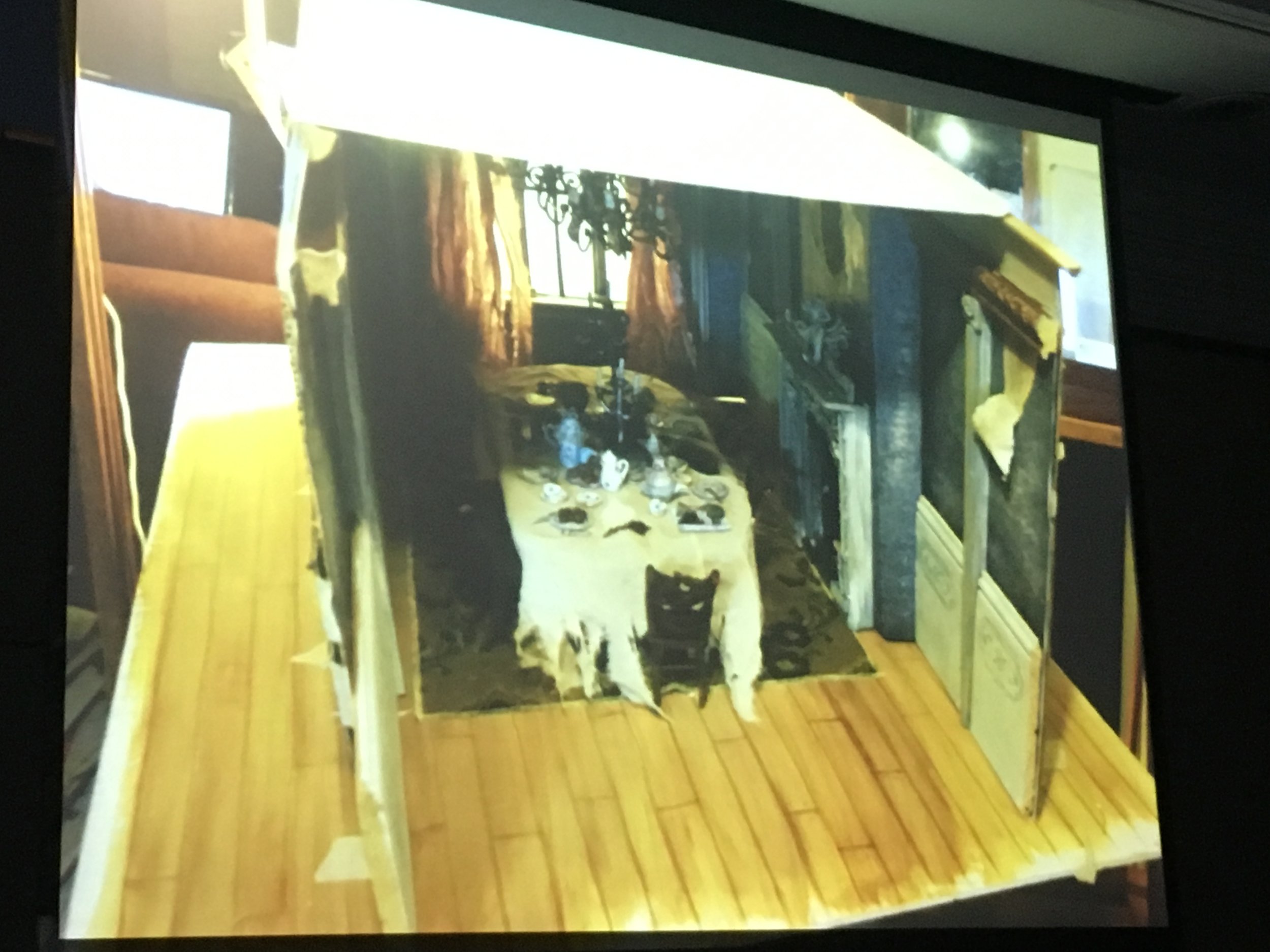
We then had a closer look at Sarah’s broad choice of medium that demonstrate her multi-talent and joy in experimenting. While her book ‘Sounds Spooky’ (written by Christopher Cheng) was created using hand-made puppets and cardboard sets and then photographed, others are done on paper with layers of Prismacolors, oil paint and many more. Currently Sarah is experimenting with ink and glazes of acrylics and oil paints.
For all three aspects – character design, perspective and choice of medium – it is important for an illustrator “to speak clearly so you can communicate your ideas” visually. These visual elements enrich or undercut the text and help children to decode the story in a special way.
I think it is fair to say that Sarah Davis yet again not only inspired us with her amazing talent and colourful treasure box of wisdom but also how she incorporates her family life into her work. Being a parent and full-time working is not always easy but Sarah sure made it look like that. Holding that thought I am now off to find out how on earth she actually fixed climate change with just a massive fan in her heroic hands….
Katrin Dreiling Roving Reporter
#SCBWISyd
