Roving reporter Peter Taylor’s impressions of multi-award-winning writer/illustrator Bruce Whatley’s presentations and workshop activities.

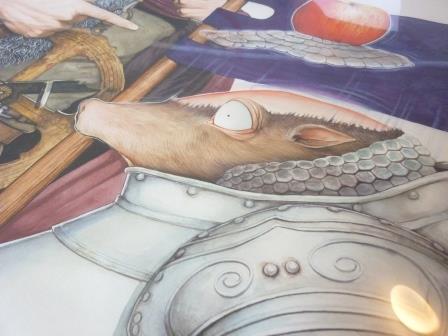
A sneak peak of Bruce's 'no compromise' project.
Attendees at Bruce Whatley’s picture-book Masterclasses varied in their levels of expertise from authors and writers with limited or no drawing expertise, to acclaimed artists, and he made us all feel equally at home, firstly breaking up a text into the normal 14 spreads, plus page 32 if required. We then envisaged characters and setting, and sketched a double page opening. It was fascinating to discover the range of imaginative interpretations that people considered.
It was also interesting to hear the experiences of published individuals as Bruce questioned the degree to which each publisher had tried to keep author and illustrator apart. (Publishers often try to do this, but they usually fight a losing battle in Australia as the majority of our children’s book creators are Facebook friends, at the very least.) Bruce feels that when completely separated, it’s easy for neither partner to see the big picture, and though he discards most illustration suggestions, he recognises that, in general, books are improved by an element of dialogue and cooperation. Bruce also highlighted the danger in self-publishing if there’s a lack of external professional artist input from an art director or similarly qualified individual. It would also be preferred that someone who is an art creator or expert is involved in choosing an appropriate book cover design, not just have this task left to sales and marketing professionals to announce their requirements.
Bruce provided so much useful advice that we all wrote notes by the dozen – “…on a spread, the action takes place from left to right. …It doesn’t work to flip a picture horizontally. …Be consistent in placing the text so that readers don’t have to search for it – start in the same place on each spread…”

Image from Flood created using his left hand.
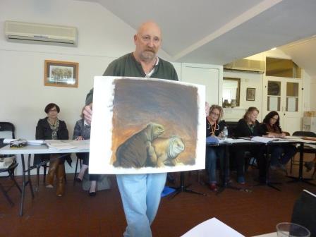
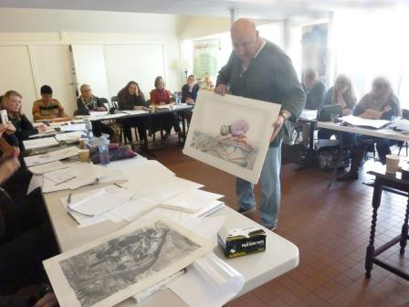
While it’s possible for writers to manufacture stories by creating lists and other devices, attendees nodded in agreement with Bruce that the best ones invariably come from the soul – predominantly based on experiences and family happenings. He recounted how several of his own stories came to be written and we marvelled at the detail in the large-sized originals on full sheets of watercolour paper that were shown and passed around - and also in the wide variety of styles and media in which he has worked over the years.
Bruce’s descriptions of his drawing and painting techniques, his answers to questions and the input from other attendees will all be immensely useful – though we were encouraged to develop our own personal styles and working methods. As a large number of illustrators favour watercolours, I was delighted to discover that, like me, Bruce has used diluted gouache for some works, and that he doesn’t stretch paper. Few of us will immediately purchase the Cinema 4D computer program that he demonstrated, but we greatly appreciated looking over his shoulder as he worked, and now have an awareness of its potential value and capabilities.
I think that many of us, in the coming months, will continue to reflect on Bruce’s ‘no compromise’ ideal, but with the acclaim and awards gained for his books, it was surprising that when he develops a new project idea, it is not always instantly accepted by the first publisher he contacts. We must all recognise through our research that each publisher’s list has a unique blend of book styles, and Bruce also gets told that ‘…we don’t publish books like this.’
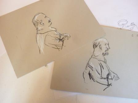
After we had created interesting characters and settings according to the random criteria supplied by audience members, and then based our design on someone else’s effort (try drawing a jealous astronaut jellyfish wearing a neck-tie and living in ancient Rome (OK, just use a few of them)), we transitioned to unfamiliar territory and drawing with our left hand. A still-life was drawn firstly with the right hand, and then with the left, and most of us agreed that the line quality was more interesting when using the left hand (except for James Foley’s version, because he’s naturally left-handed). And then our final task was to sketch Bruce as our model, initially with black Conté pastel in our right hand and white in our left (equal amounts of black and white to be applied in five minutes), and then with the colours swapped. The result, for me, who’s unaccustomed to drawing people: I certainly did find it easier to get more realistic proportions with the black in my left hand – the top left picture shown in the image, and I believe others felt likewise.
I’ll need to experiment a lot more prior to drawing the illustrations for a whole book using only my left hand, as Bruce did for ‘Giants of Galapagos’ and ‘Flood’.
Thank you, Bruce, for inspiring us and for all that you so generously shared.